UI Component
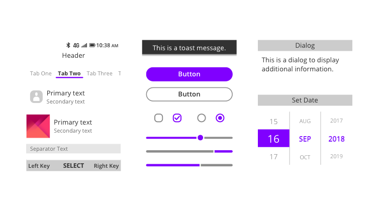
KaiOS apps are created from UI Components which define common interface elements. By following UI Components, apps achieve a consistent appearance across the system.
The Units of spacing defined in KaiOS are specified in rem. On a screen with a density of 140, 1 rem is equal to 10 pixels, which is a baseline QVGA resolution on a 2.8-inch display and the resolution is 240*320.
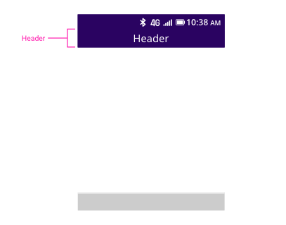
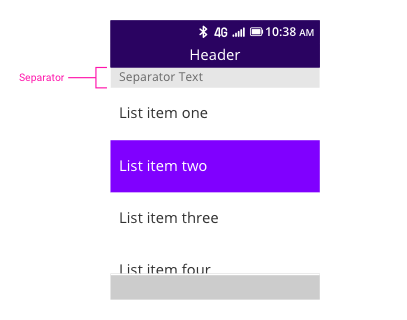
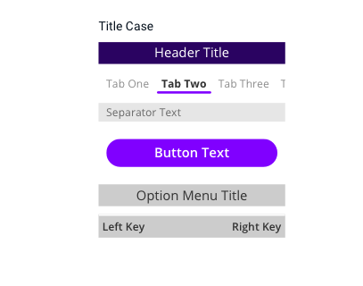
Header
A header appears below the status bar. The text in the header is centered and displays the app name or page title.
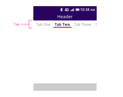
Tab
A tab appears below the header, which separates grouped content and provides the ability to quickly switch between different sections of an app by tapping left or right on the navigation key.
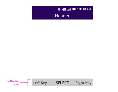
Software Key
The software key appears at the bottom of the screen, which corresponds to the center, right, and left hardware keys. Each key may or may not appear depending on the availability of features.
In certain conditions, it is allowed to use icon for the center key if it is of universal recognition, such as play or pause icon.
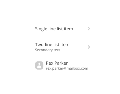
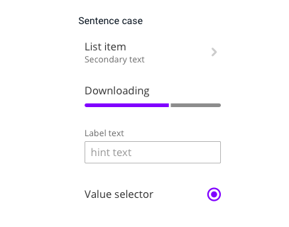
List
Lists are typically used to navigate to a new screen, or to display information or controls.
Separator
Separators are used to describe a subsection of content. The separator often appears between list or grid items, as it helps separate different groups of content.
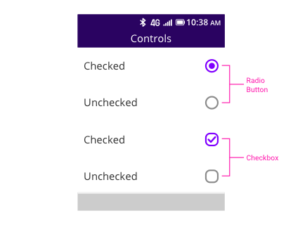
Selection Controls
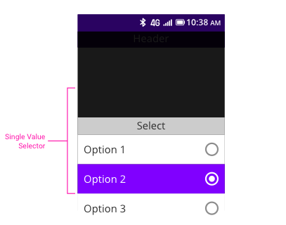
Checkbox and Radio Button
Checkboxes allow users to select multiple options from a set. Radio buttons provide the ability to select one option from a set.
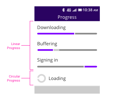
Progress Indicator
Progress represents how long the current operation will take, or appears as indeterminate when the completion status cannot be determined.
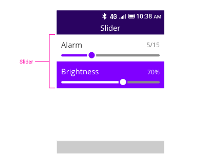
Slider
The slider is an extension of Progress that adds a draggable thumb. On a non-touch device, the user can press the Right and Left keys to set a new value for a given control, such as volume or brightness.
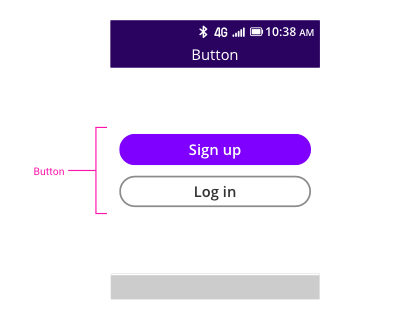
Button
The button is used to perform an explicit action. It can include a title or combine with an icon.
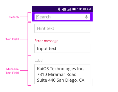
Text Field
A Text Field is an area for entering text data and can be as simple as a text-only entry field in a list item or a search bar in the header. For multiple-line input, the center key is Enter for a new line.
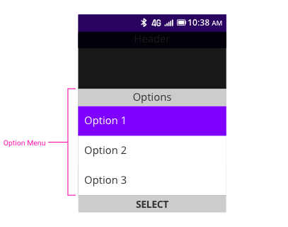
Option Menu
Option Menu provides a list of choices on a pop-up component which may appear with controls such as a checkbox or radio button. It allows users to perform actions on objects without having to leave their current view.
Value Selector
A Value Selector provides an easy way to select single or multiple values from a pre-determined set of values.

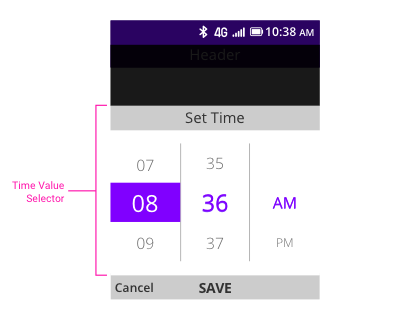
Date/Time Value Selector
A Date Value Selector provides spinners for settings date, and a Time Value Selector provides spinners for settings time.

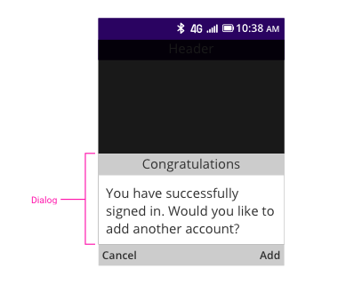
Dialog
A Dialog provides the user with some important information, asks the user to take or confirm an action, or allows the user to make a choice or enter information.
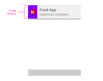
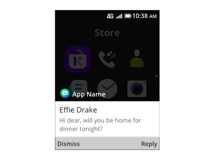
In-app Notice
In-App Notice appears at the top of the screen like Toast, but with different layout. An In-App Notice has an app icon, primary text, and secondary text. After it disappears from the top of the screen, users can still access it from Notices screen.
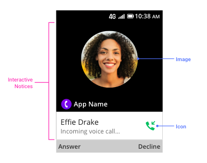
Interactive Notice
Interactive Notice appears on screen like dialog; it’s designed particularly to handle incoming call use case for 3rd-party communication app. It will pop up on screen and force users to interact with it, which will cause interruption. Therefore, not using Interactive Notice is suggested unless the notification requires immediate action (such as answering call).
Interactive Notice has app icon, app name, primary text, secondary text and optional icon. It will be shown as full screen mode if image is added, and it can only show one line of primary text and one line of secondary text. Interactive Notice without image can show approximately 90 characters text.
Selecting any softkey on Interactive Notice will dismiss the Interactive Notice screen and it will also be dismissed from Notices screen. (Selecting Back key will dismiss the Interactive Notice, but it will not be dismissed from Notices screen.)
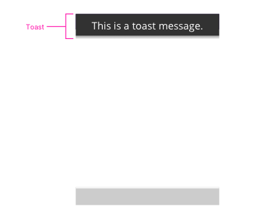
Toast
Toast appears at the top of the screen and provides important information, or alerts the user to a system event. It can’t be interacted with and will automatically time out depending on the length of the content.
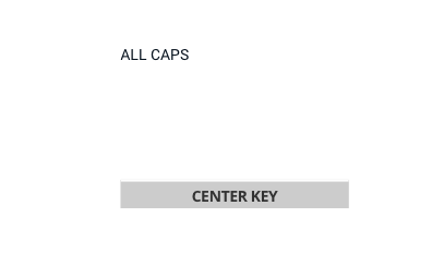
Capitalization for UI Components
Three styles are used: Title Case, Sentence case, and ALL CAPS.
Useful third-party component
For some reason,We did't publish our official component,But there are some good design third-party component,They follow closely our design guideline.
KaiUI from AdrianMachado or follow design at kai in medium Design at Kai